Sunday, November 25, 2012

WGTB Reviews Journey Into Mystery #646

My first encounter with Kathryn Immonen’s writing came with Heralds, the five-part miniseries Marvel released in August 2010. What I gathered from this mini is that Immonen is both a quality writer and very good at writing strong female characters. Because of this, when it was announced she would be taking over a re-focused Journey into Mystery with the Lady Sif in the lead role my attention was grabbed. 
 
Marvel's Journey Into Mystery #646 (January 2013) Written by Kathryn Immonen with art by Valerio Schiti, colour art by Jordie Bellaire, letters & production by VC's Clayton Cowles, cover art by Jeff Dekal. Edited by Lauren Sankovitch. PRICE: $2.99
Immediately upon arriving at the shop on Wednesday, my local proprietor recommended the book to both me and others in the store. I was intent upon reading it already, but when I did, I came across a story that starts with Sif helping out her fellow Asgardian civilians before moving on to a quest to find the skills and talismans that it takes to be a great warrior. There was a little violence too. 

Sif seeks to learn in Journey Into Mystery #646 (January 2013)
There is a vastness and energy to the writing that gives this comic a real sense of impending adventure and it should play well as Journey progresses. The book was also loaded interesting and funny in-jokes (with great one on the opening splash) and the subtle reference to my favourite writer, J.R.R. Tolkien, further made the book endearing to me. This tells me that careful attention has been taken to crafting this book and it's a good thing to see.  

Can you spot the Tolkien reference?
With regard to the art, frankly, I'd never seen any of Italian Valerio Schiti's work before this book, but so far I think it's fairly good. With a welcoming blend of realism and fantasy, it captures the essence of this book very well and because of that makes it a fun read. Because of that, this abridged and quick review gives Journey into Mystery #646 4/5 STARS. 

Sunday, November 18, 2012

WGTB Reviews Fantastic Four #1

At Fan Expo Canada this summer, Axel Alonso told us in a panel discussion that Marvel NOW! was going to be an opportunity for the new writers to make a 'hostile takeover' of their rebooted books and really make them their own. What exactly the editor-in-chief meant by this, we probably won't know until their respective sixth issues, but Fantastic Four #1 in twenty-two pages gave us a pretty good idea of what this meant to Matt Fraction: he's taking this book out of time and out of space!
Marvel's Fantastic Four #1 (January 2013) Written by Matt Fraction with pencils by Mark Bagley, inks by Mark Farmer, colours by Paul Mounts, letters by VC's Clayton Cowles.  Edited by Tom Brevoort & Lauren Sankovitch. Price: $2.99 

(Spoilers Below)
With art by Mark Bagley and Mark Farmer, this first issue of the still self-proclaimed "World's Greatest Comic Magazine!" begins with a quick back and forth through time, which is too complicated to explain here. It eventually settles, however, on the Baxter building complete with the members the extended Richards gang acquired during Jonathan Hickman's run. From there we move to Johnny Storm on a (hilarious) date in the Negative Zone, Ben Grimm in trouble on the Internet and Sue surveying her 'circus'. The issue then resolves itself with Reed suggesting the group head into space and time on board the 'greatest classroom ever concieved', all the while keeping secret the real goal of his voyage, which is to find a cure for the team's decaying powers.  
Johnny Storm takes his date to the Negative Zone from Marvel's Fantastic Four #1.
As happened in All-New X-Men #1, this book will play fast and loose with the space-time continuum and you get the sense from the get-go that it's going to focus on high space adventure. Frankly, it's great to see Fraction continue with the idea of the Fantastic Four being as much scientists and educators as super-heroes, and I'm already confident that it's going to have some great writing. Character wise, I was a little perturbed that Mr. Fantastic kept something from his wife, but if this turns out to be as important of a plot point as I think, then it will turn into some interesting drama and all will be forgiven.

Bagley's art captures the scientific aspect of Fantastic Four #1 well. Some of the faces, not so much.
Johnny Storm's date with a celebrity at the beginning was funny enough to give me a laugh out loud moment at work (I've felt the same way vis-a-vis a girlfriend and her mother), and was very true to character. Likewise was Sue Richards when she surveyed her domain with the love, wonder and protective energy we've come to expect from this stalwart Marvel character. 

Sue Richards surveys her 'circus' and Ben Grimm tries to stop something from going viral in Fantastic Four #1
Mark Bagley and Mark Farmer's art was good. I happened to notice that in some cases the female characters bear a striking resemblance to each other, but all in all the artwork seemed to capture the fantastical nature of the comic well and should work with the 'big idea' space themes we've come to expect from the Fantastic Four. Truth be told, I'm a F4 fan through and through and will always give it the benefit of the doubt. Happily, this issue gives me no reason not too once more: it's a good start and will give us the solid cosmic-themed family drama we've come to expect from one of Marvel's greatest books. 4/5 STARS

Friday, November 16, 2012

WGTB Reviews All New X-Men #1

Marvel NOW! continued this week with All-New X-Men #1, Mighty Thor #1 and Fantastic Four #1 arriving on the shelves of our local comic shops. Because this is a big week for first issues from Marvel, I'm going to try to write more than one review. I'll begin with a book I have particularly been looking forward to: All-New X-Men #1, a comic that brings the original five X-Men from the past and drops them into the present day. 

Marvel's All New X-Men #1 (January 2013) Written by Brian Michael Bendis with pencils by Stuart Immonen, inks by Wade Von Grawbadger, colours by Marte Gracia & letters by VC's Cory Petit. Edited by Nick Lowe $3.99

(Spoilers Below) 


Honestly, when I first heard Marvel was doing this, I was skeptical as it almost sounded a little too ‘comic-booky’. But the more I thought about it, the more I liked the premise. Having just witnessed the massive fall from grace that Scott Summers experienced during Avengers vs X-Men, I got thinking how interesting it would be for a younger Cyclops to see what he's become. Of course, with Jean Grey having been gone for years now, I also thought it'd be interesting seeing how those characters who've particularly missed her react to a younger Jean, especially with Brian Michael Bendis writing the dialogue.  

All-New X-Men #1 starts with Hank McCoy in pain as he's about to experience his third mutation. We don't see this, as the story quickly moves from the Gold Coast of Australia to Ann Arbor, Michigan where we see mutants appearing out of the blue and Cyclops, Magneto and Emma Frost assisting their new 'brothers and sisters' handle the authorities who are trying to arrest them. This hostility is noticed by the X-Men at the Jean Grey School and we then move to a debate between its leaders who are trying to resolve how to respond to the hostility of their erstwhile leader. We don't see a resolution to the debate, because before this is resolved, we're sent to a flashback of the original X-Men where Beast arrives to talk his colleagues and ask a younger Cyclops to go into the future and talk some sense to the man he has become.
Beast in All-New X-Men #1 (January 2012)
While I typically start my reviews with my assessment of the writing, in his particular case I'd like to start with the artwork. I really enjoyed Stuart Immonen’s pencils and certainly count him as one of my favourite artists in comics right now. The younger X-Men, while having a somewhat retro look, do not look dated or tied to any particular era and this makes their look work. Jean Grey's hair, for example, looks like it could be from either the 1960s Batman show or an early 90s episode of Friends. The lines are smooth, the faces expressive and interesting, and the action sequences enjoyable. Immonen rendition of Beast also has a cool 'early 90s' Jim Lee's X-Men #1 look, which ties the 2012 characters to that important era magnificently.  

Which takes us to Bendis' story, which was good but not great. Again, as a first issue there wasn't too much to really get worked up about. But my sense is that this story could have used a little more packed into it, especially given that it was $3.99. Frankly, it was a 'Scott's at it again' comic which is fine, but I was starting to look forward to moving on from this past summer. Don't get me wrong: there were good parts and the exchange between McCoy and the younger Cyclops was especially well written and captured their personalities very well. I just felt a little short-changed because I didn't get to see the young X-Men move into the future by the end of the story. That would have made a great concluding splash for Immonen and really get us readers pumped for the second issue. 
The younger X-Men argue about their role in the world in All-New X-Men #1 (January 2012)
So All-New X-Men #1 was a decent enough start to what will obviously be a flagship series for the X-books. There's certainly places for this comic to go, and as I said earlier, it will be great seeing the older X-characters interact with the new. Stuart Immonen's art was great, but on the whole the story could have used a little more substance to it. Because of that it only gets  3.5/5 STARS.

Sunday, November 11, 2012

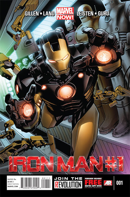
WGTB Reviews Iron Man #1

Marvel NOW! rolls on with Iron Man #1 hitting the shelves this past Wednesday. To begin, I should say I've never been a big Iron Man reader. I like the character but have never seemed to pick up his books. I know it's shameful, especially given the cinematic success Marvel/Disney has had centreing their universe (largely) around Robert Downey Jr. playing the role.  But for some reason Tony Stark is just someone in Marvel that has never caught my eye in the comic book store. I tell you this because my review may seem a little light in content and a detailed understanding of Iron Man's rich history in the medium. I'm also telling you because I'm using this first issue of Marvel NOW!'s Iron Man as an opportunity to get a fresh start on Tony Stark and frankly see this as a reason why these relaunches and reboots are a good thing for ignorants like me. On with the review.
Marvel NOW!'s Iron Man #1 (January 2013) Story by Kieron Gillen, pencils by Greg Land, inks by Jay Leisten, colours by Guru eFX and letters by VC's Joe Caramagna
$3.99

(Spoilers Below)
Having enjoyed Kieron Gillen recent runs on X-Men and Journey Into Mystery, I knew I was going to like this book to some degree. Gillen is a very skilled writer and has a knack for taking long established characters and making them his own. My initial thoughts were that tonally, Tony Stark was very similar to his cinematic counterpart and this was helpful I immediately liked him and knew this was a fellow I could follow regularly. The story begins in a posh New York bar with Tony working his magic with a beautiful woman. After he takes the party home and is about to seal the deal, he gets an urgent and distressing call from Maya Hansen who says that the 'Extremis is loose' and she's already 'probably dead'. We then fast forward to see a bad infomercial type of television program where Extremis' are being sold to regular folks. Iron Man subsequently crashes the party and learns there are four models loose on the world.

Extremis models and Iron Man from Iron Man #1 (January 2013)
I enjoyed the book and it wasn't without some solid humour. Probably the best line was when Tony went undercover at the Extremis sale by simply shaving off 'the world's most famous mustache'. Very Clark Kent. I'm not sure if the four Extremis villains will be long-term antagonists for the book -- this first arch is five books and that would match quite nicely with there being four out there. But it would be cool with a model popping up every now and then and this could lead to some long-term problems for Iron Man. The story also has a significant international dimension and it would will be neat seeing Gillen taking Tony to different locales around the world. I loved what he did with Sinister and London in Uncanny X-Men  
Iron Man armour in Iron Man #1 (Janurary 2013)
Unfortunately, while I enjoyed the early stages of Gillen's work on this book, I can't say the same for the art. In places Greg Land's work was very good: the below shot of Iron Man hovering over the cityscape is an example of the awesomeness that is Iron Man. But by and large his human depictions didn't have any stand-out qualities to them and while it doesn't look bad, there really isn't anything to grab the readers and make us say 'Wow!'   
Iron Man hovers over the city in Iron Man #1 (January 2013)
That said, it was a reasonably good comic book and because it has a very 'one-shot' feel to it, I think it's a great start for any new or lapsed Iron Man fan. I'm certainly going to find some Iron Man TPBs and get caught up on him, and will probably keep up with this particular comic for the next little while.  3.5/5 STARS